




PROJECT GOALS
2. User Interviews
Key insights


3. Competitor Analysis
I analyzed 3 popular services: KudaGo, Kaver, and Afisha.
all widely used in Russia.
Afisha
+ Covers recommendations and news
+ The only app with ticket purchase integrated
– No tools to find company
– No user events support
All three apps support search by map, but none of them combine all key features — users often have to switch between apps to cover different needs.
Conclusion
The analysis revealed several structural gaps in existing solutions that shaped my design direction:
4.User Flows
Event Discovery FLOW
This flow solves the lack of all-in-one functionality by integrating browsing and ticket purchasing. The ability to view results on a map also helps users with cars plan their trips.
– Context-aware filters: mood, time, price, distance, and more
– Trusted visuals and user-generated reviews
– Integrated ticket purchase — no redirects
Place Discovery FLOW
This flow supports spontaneous exploration without needing to attend scheduled events.
– Designed for unplanned, local exploration
– Filters by vibe: “quiet”, “crowded”, “romantic”
– Real photos and insights from real people
Event Creation FLOW
This flow addresses the lack of user-hosted events in other services and helps users create social opportunities themselves.
– Minimal form with smart defaults
– Real-time preview and easy editing
– Light moderation to maintain quality and trust


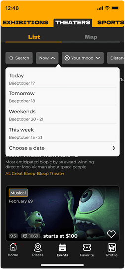
Context-Aware Filtering
Problem:
Users were overwhelmed by long, generic lists.
Solution:
i've decided to use advanced filters (mood, time, price, category, etc) upfront to narrow down results early.
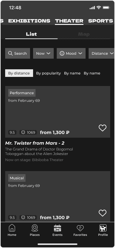


Two Browsing Modes: List or Map
Problem:
Some users plan spatially (e.g. “what’s near me”), others want quick scanning.
Solution:
A toggle between list and map lets users switch modes instantly.
Effortless
Event Creation
Problem:
Creating events felt bureaucratic in other apps.
Solution:
A simple form with live preview and light moderation made publishing easy and fast.


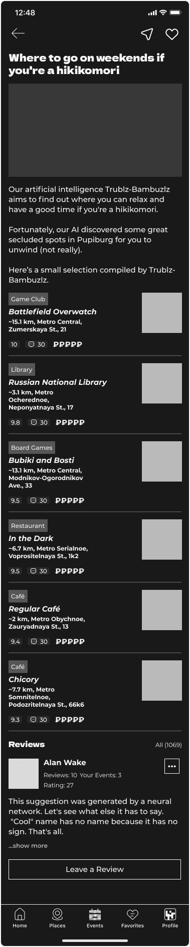
Personalized Collections
Problem:
People don’t want to scroll forever — they want tailored ideas.
Solution:
i've made personalized collections like “Tonight near you” or “Events for introverts”.
Take a closer look
at the selected wireframes
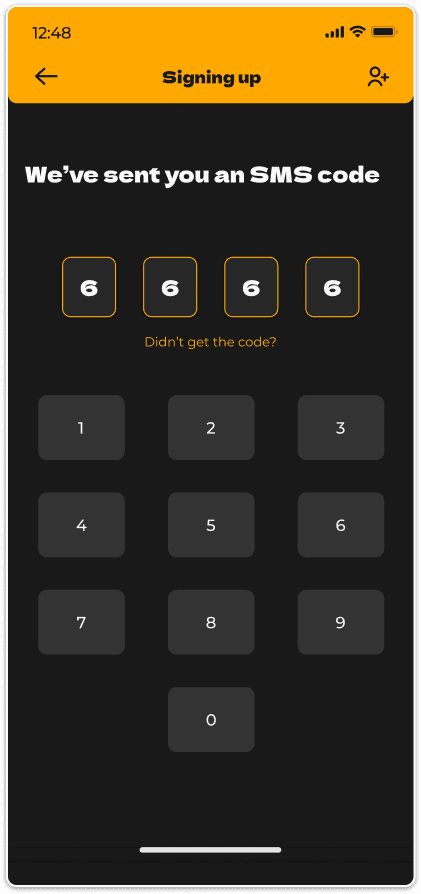
Onboarding & Signing Up
A playful onboarding flow helps users understand the app’s tone and purpose.
After that, a short sign-up process sets up personalized recommendations.




Home & Discovery
Whether users want to explore manually or just see
what’s trending — the home screen gives both.
Contextual filters, map/list view, and personalized Collections included.
HOME SCREEN is the centre of operations. You can start looking for events or places via searching, personal collections, top-picks, and even stories.


filters, and real visuals make it easy to find something fun — right now, nearby. Whether it in a list view or on a map.
Event Card
A detailed yet digestible screen with everything users want to know:
location, time, price, reviews, and vibe.
And a godd way to find a person to go with.


Creating Your Own Event
A short, visual form lets users create events in minutes.
Pick a date, location, assign a price
if needed, and upload a photo — and immediately see
how it will look before publishing.


Messaging other users
Messenger functionality - how else would you try to contact other people
who attend to the same event as you?
Users can send direct messages to each other to coordinate plans, ask event-related questions, or just connect.
This is enabling lightweight social interaction without leaving the app.


7. CONCLUSION
